Zomato Support Flow — Redesign
Rebuilding a chatbot-only support experience so users in urgent situations can reach a human, track their complaint, and never get auto-closed mid-crisis.
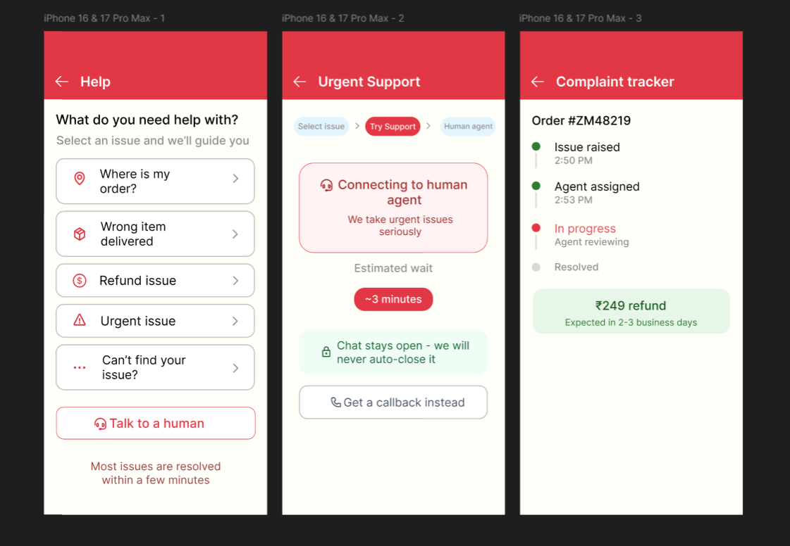
Independent concept redesign — not affiliated with or endorsed by Zomato.
Overview
Zomato's customer support experience is entirely chatbot-driven (bot name: DIA). Users facing urgent situations — wrong orders, missing deliveries, or even medical emergencies — cannot reach a human agent. The chatbot also auto-closes conversations due to inactivity, leaving problems unresolved. This case study documents how I identified these pain points using real evidence, defined the core problem, and redesigned the support flow across three screens.
Problem
Zomato's support forces every user through chatbot "DIA" regardless of urgency.
Evidence 01
A user said: "This is a medical emergency. I need to speak to a human agent immediately."
DIA replied: "I truly wish I could connect you to a human agent, but I am unable to do so."
Evidence 02
In another session, the bot greeted the user, asked them to select an issue, then closed the conversation after 10 minutes of inactivity — zero resolution, only a thumbs up/down rating offered.
Problem statement: Users who contact Zomato support during urgent situations cannot reach a human agent. The chatbot cannot escalate issues and auto-closes conversations — leaving users frustrated, helpless, and unresolved.
Research
I collected real screenshots of Zomato's support flow, spoke informally with 3 users who regularly use food delivery apps, and reviewed App Store complaints mentioning Zomato's support experience.
- No human escalation path — the bot explicitly refuses, with no override.
- Auto-close causes abandonment — no saved context, no callback.
- No complaint tracking exists — no status, ETA, or confirmation.
- App Store reviews confirm the pattern — "useless bot," "can't talk to anyone," "refund never updated."
Define
Persona · Priya, 24
Frequent food delivery user
Orders 4–5x/week. Experienced wrong/missing items twice.
"I just want someone to fix my order. Why do I have to fight a robot?"
Design principles:
- Always show a path to a human — never hide it behind steps.
- Never auto-close without explicit consent.
- Show complaint status at all times.
- Reduce anxiety through transparency, not just speed.
Smart Help Menu
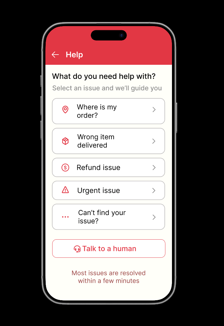
Large, tap-friendly issue cards (Where is my order? / Wrong item / Refund issue / Urgent issue / Can't find your issue?) replace the chatbot as the primary entry point. "Talk to a human" is always visible as a secondary outlined button. Reassurance copy: "Most issues are resolved within a few minutes."
Urgent Support
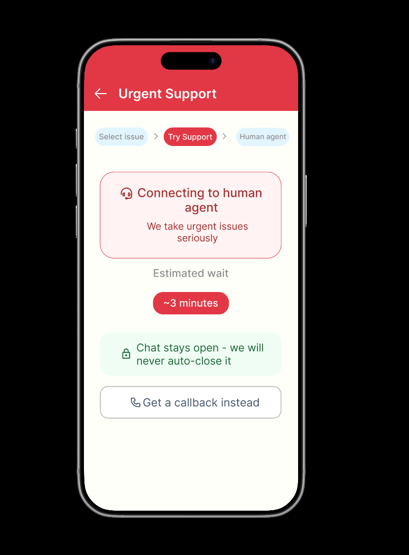
Tapping "Urgent issue" triggers an immediate human connection. Red banner ("Connecting to human agent") with a ~3 min wait estimate. Step indicator — Select issue → Try Support → Human agent — shows progress. A green box reads: "Chat stays open — we will never auto-close it." A callback option is available as a secondary path.
Complaint Tracker
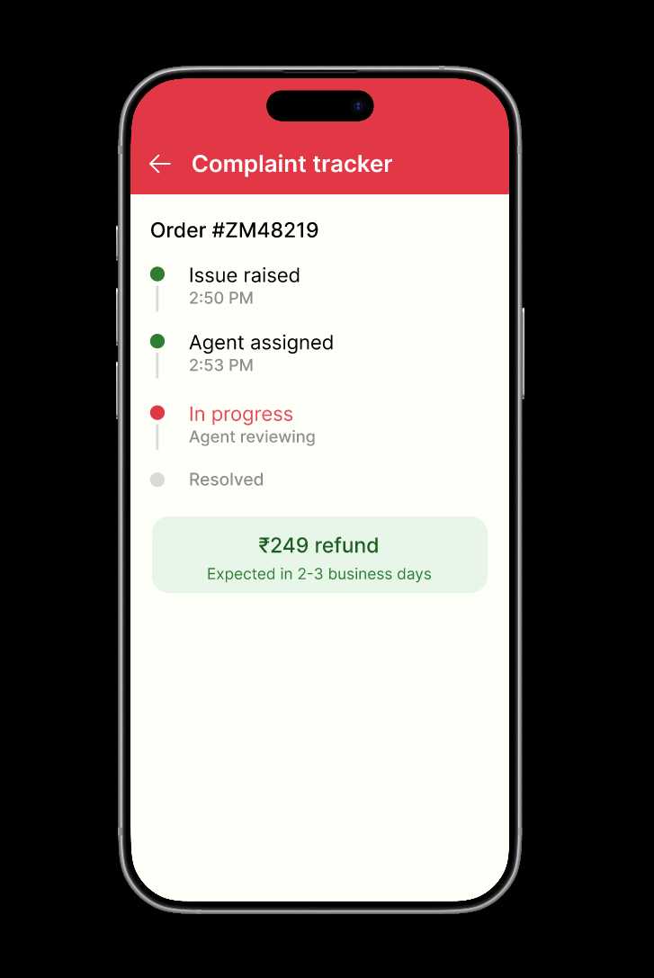
Live timeline: Issue raised → Agent assigned → In progress → Resolved, each with timestamps. Refund amount and ETA in a green card (e.g. ₹249 · Expected in 2–3 business days). Status is visible at every step — the entire point of the redesign.
V1 → V2 self-critique
After completing v1, I self-critiqued and caught 5 issues before presenting:
CTA hierarchy
"Talk to a human" too prominent — restyled as secondary outlined.
Card affordance
Cards looked static — added a chevron (>) to signal tappability.
Label clarity
"Other" was vague — changed to "Can't find your issue?"
Empty space
Filled with reassurance copy instead of leaving it blank.
Border contrast
Improved to meet accessibility visibility standards.
What I'd Test Next
- Test issue card labels with 5 real users.
- Measure whether "Viewed by agent" status reduces repeat contacts.
- A/B test "Talk to a human" button placement.
- Validate whether "we will never auto-close it" reassures — or draws attention to a past bad experience.
Success metric: reduction in unresolved support sessions + improvement in post-support satisfaction rating (thumbs up/down → 5-star with comment).
Learnings
This was my first UX case study, done for interview preparation. Real problems don't need to be invented — the screenshots already told the entire story. Emotional pain matters as much as functional pain: the medical emergency screenshot was an empathy failure, not a functional bug. Self-critique before presentation is non-negotiable — reviewing v1 myself caught 5 real issues.
Independent concept redesign — not affiliated with or endorsed by Zomato.